A portfolio site has one job that matters more than the rest: to make a stranger understand what you make, believe you make it well, and know how to start a conversation. The palette, the scroll animations and the custom cursor all exist to serve that. The parts people most often get wrong are the quiet ones — navigation, typography and accessibility — and they decide whether your work gets seen or clicked past.
None of it needs a big budget or a design degree. It needs a few decisions made deliberately, in the right order.
Decide what the site is for before you open a design tool
Start with the awkward question: who is arriving, and what do they need in the first ten seconds? A gallery director, a hiring manager and a potential client all want slightly different things, but they share a pattern. They want to see a piece of work, understand its context, and find a way to contact you. Anything that delays those three steps is costing you.
Write the answers down before you choose a template:
- Which five pieces of work represent me best right now?
- What can I say about each one in two sentences — what it was, what I did, what changed?
- Where should a visitor end up: an email, a booking link, a direct message?
- What am I leaving out? Old student work counts.
That last point matters more than it sounds. Six strong projects read as confidence. Thirty read as indecision, and they make the good work harder to find. If you cannot choose, put the weaker pieces on an Archive page and link it quietly in the footer.
Sketch the site on paper first — four boxes will do. Home, Work, About, Contact. Most portfolios need nothing more. Project pages live under Work, and you can add a shop or a blog later, when there is an actual reason for one.
Build navigation that gets out of the way
Navigation is a promise about where things are. Break it and visitors stop trusting the site, even if they cannot say why.
Use labels people already know
“Work” beats “Portfolio”, and “About” beats “The Story So Far”. Clever labels feel like a puzzle to someone skimming on a phone at a bus stop. Keep the main menu to five items or fewer, keep the same order on every page, and make sure your logo links home and looks like a link.
Design the mobile version first
Most people will see your site on a phone, so decide how the menu collapses before you design the wide layout. A labelled button that opens a full-screen list is reliable and easy to tap with a thumb. Traps to avoid:
- Hover-only navigation. Anything revealed on hover vanishes on a touch screen, so make those menus open on tap as well.
- Contact details hidden behind several taps or a menu that needs scrolling.
- Surprise horizontal scrolling, or a swipe carousel with no arrows or dots.
Check the browser back button, too. If projects load without the address changing, visitors lose their place and end up somewhere they did not expect. Each project deserves its own page and its own heading.
Choose typography for the work, not for yourself
A portfolio’s type is a frame. Its job is to be invisible enough that the work inside gets the attention.
Two typefaces are plenty
One for headings, one for text — or a single family used at different weights and sizes, which is often the stronger choice. A characterful display face paired with a neutral, highly legible body face will carry almost any portfolio. Three or four families rarely look intentional; they look like a font sale.
Legibility beats novelty every time. If your body text is decorative or difficult to read at 16 pixels, people will skim and leave. Read a full paragraph in your chosen font, on a phone, in daylight. That test tells you more than any pairing guide.
Control size, measure and contrast
Set body text between 16 and 20 pixels with a line height of roughly 1.5 to 1.7 times the font size. Keep lines to around 60 to 75 characters, which means a narrower column than you expect on a desktop screen. Use a clear scale for headings: if the body is 18 pixels, an h2 at 30 to 34 pixels and a main heading at 44 to 50 will feel ordered rather than shouted.
Project text should be easy to scan: title, role, year, then two sentences of context. Do not set long paragraphs in capitals, italics or pale grey.
Treat accessibility as part of the craft
Accessibility is not a separate pass at the end; it is what happens when you make sensible decisions as you go. It also makes a site feel calmer and more considered for everyone.
- Contrast: body text against its background should stay at a contrast ratio of at least 4.5:1. Grey on white looks elegant in a mockup and disappears in sunlight.
- Alt text: describe what an image shows and what matters about it — “poster for a ceramics fair, bold black type on cream paper” rather than “image1”.
- Keyboard use: tab through the site. You should always see where you are, and be able to reach the menu, every project and the contact form without a mouse.
- Colour: never use colour alone to signal a link, an error or a state. Add an underline, an icon or a word.
- Movement and sound: no autoplaying audio, and soften or remove large scroll effects for visitors who have asked their device to reduce motion.
- Captions: any video with speech or meaningful sound needs captions, not just a transcript link.
If you use a website builder, some of this is handled for you and some is not — alt text and heading structure almost always need your attention. Use one main heading per page and use subheadings in order, rather than picking sizes because they look right.
Test it with real people and real devices
Send the draft to three people who are not designers and ask them to find your best piece of work and your contact details. Watch, do not explain, and note where they hesitate. Then check the site on a small phone and a laptop, and reload it with images blocked. If the text and the structure still make sense on their own, you have built something solid.
Where to spend your first hour
- Write down the five projects you are showing and two sentences about each.
- Sketch four pages on paper.
- Choose one body font and one heading font, then set your text sizes.
- Build the mobile menu and the route to your contact details.
- Check contrast, alt text and keyboard access before adding a single animation.
A portfolio is never finished, and it does not need to be. Get the quiet parts right — clear labels, readable type, work anyone can reach — and the site will keep doing its job while you get on with making things.
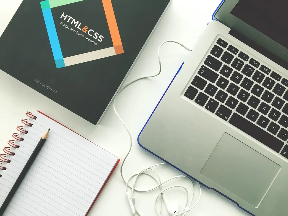
Photo: vanmarciano / Pixabay