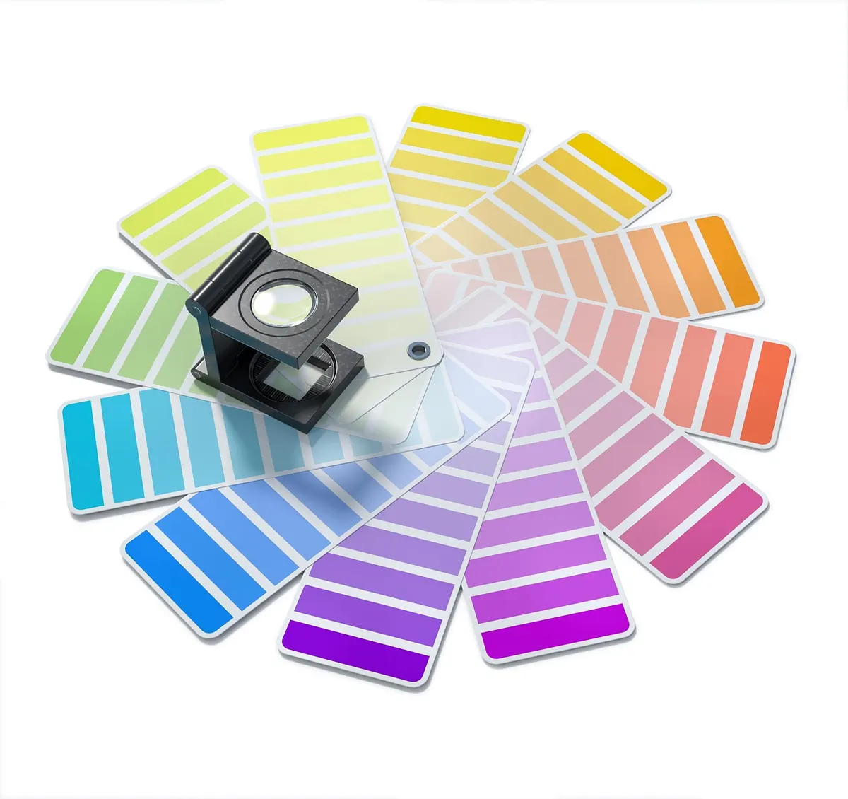
Colour does more work in a portfolio than most of us admit. A visitor forms an impression in the first second — warm or clinical, playful or precise — and much of that impression comes from hue, contrast and the amount of quiet space around them. The problem is that palettes often get chosen the way paint gets chosen: by eye, in isolation, late at night. Run the checks below before you commit. It takes an hour, it saves months of fiddling, and it keeps the work — not the background — as the thing people remember.
Start With Three Words, Not Three Colours
Before you open a colour picker, write a three-word brief for the feeling you want. Something like “warm, editorial, restrained” or “cool, technical, exact”. Those words settle arguments later, when you are staring at four near-identical greys and cannot decide.
Then look at the work itself. An illustrator working in ink and gouache usually needs a paper cream and an ink black before any hue arrives. A motion designer showing dark showreels may want deep neutrals so the footage carries the brightness. Think about where the portfolio will be seen, too: a palette that sings on a calibrated studio monitor can lose its softest accent entirely on a phone in daylight.
Give Every Colour a Job
Most portfolios need five to seven values, not five unrelated hues. Build around one base family plus one accent and you get unity without monotony. Assign each value a role before you get attached to it:
- Base — the page background. One near-neutral, warm or cool, used everywhere.
- Text — a dark tone that is not pure black. A near-black on an off-white reads more comfortably over long paragraphs and looks less like a default template.
- Structure — rules, borders, card edges, dividers. A mid grey that disappears when it should and appears when it must.
- Accent — links, buttons, hover states, one highlight. Choose it last, and choose only one.
- Optional second accent — tags, filters or project categories. Only include it if you genuinely have categories.
If two roles can be served by the same value, let them be. Restraint reads as confidence.
Check Contrast Before You Fall in Love
Contrast is measured as a ratio between two colours, and the widely used accessibility guidance is straightforward: body text should reach 4.5:1, while large text — roughly 18pt, or 14pt bold — and interface elements such as icons and focus outlines should reach 3:1.
Free contrast checkers do the arithmetic for you. Enter the two hex values, read the number, adjust. Do not trust your eye, particularly late in the day on a dimmed screen. Check every combination you will actually use: body text on base, accent text on base, accent text on structure, and any light text sitting on an accent button.
When a pairing fails, darken the text rather than lightening the background. Keeping the base calm preserves the mood you briefed in the first place.
Accessibility Is More Than a Ratio
Contrast gets you most of the way. The rest is about refusing to let colour carry meaning on its own. Colour vision deficiency is common enough that you should assume some visitors see red and green similarly, or struggle to separate blue from purple at small sizes.
Do not signal with colour alone
If a project is marked “sold” or “new”, or a form field errors, pair the colour with a word, an underline, an icon or a change in weight. The same goes for links: an accent colour by itself is thin evidence that something is clickable, especially inside a paragraph.
Check every state
Hover, focus, active, visited. A keyboard focus ring drawn in your accent colour will vanish on an accent-coloured button, so give it a contrasting outline or an offset. Free colour vision simulators are easy to find online; run your home page through one and see what survives.
Put Real Work on Top of It
A palette never looks like the swatch sheet once photographs, mockups and thumbnails land on it. Place six to nine real projects onto the page and watch for three things:
- Do the images go muddy against the base, or does the base now look dirty beside them?
- Does the accent fight the work? A bright accent next to colourful photographs means one of them will lose.
- Does it hold up at thumbnail size? Grid pages are the real test; a delicate tint that reads well at full width can disappear entirely.
Finish with the greyscale test. Convert a screenshot to black and white. If the hierarchy collapses — nothing looks more important than anything else — you are leaning on hue to do a job that size, weight and spacing should share.
Write It Down So It Survives
Name colours by role, not appearance: “ink”, “paper”, “accent”, not “dark grey” or “that blue”. Then store the values in one place — a block of CSS custom properties, a tokens file, or a single-page specimen sheet listing hex codes, roles and a few example pairings.
If you offer a dark mode, do not simply invert. Re-check contrast from scratch, choose a slightly warm dark rather than pure black so it does not glare, and adjust the accent’s lightness so it does not glow against the darker base.
The rule that keeps a portfolio coherent: new pages are built from existing values. If you genuinely need a new shade, add it to the file and give it a role, rather than sprinkling it into one page and forgetting where it came from.
The Checklist
- Three-word mood brief written down.
- Five to seven values, each with a named role.
- Body text at 4.5:1 or better against its background.
- Large text, icons and focus outlines at 3:1 or better.
- Accent checked in every state, including hover and focus.
- Nothing important signalled by colour alone.
- Palette tested behind six to nine real projects, at full width and thumbnail size.
- Greyscale test still shows a clear hierarchy.
- Hex values and roles documented in one place.
- Dark mode, if used, checked separately.
When to Stop Tweaking
Any palette can be improved forever, and that is exactly the trap. Give yours a week of real use, note where it annoys you — it is almost always a hover state or text sitting over an image — make one round of revisions, then leave it alone. A portfolio palette is a container, not the exhibit. It has done its job when nobody mentions it and everybody remembers the work.
Photo: AbsolutVision / Pixabay